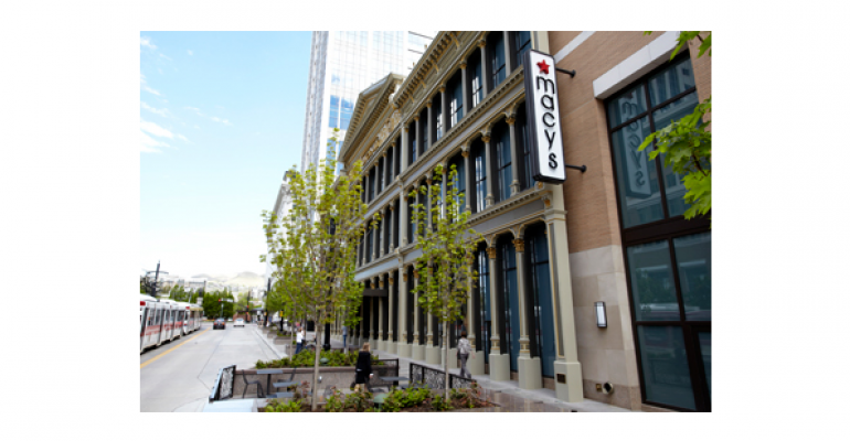
Macy’s City Creek was the third project to receive accolades in the department store category. Ultimately, the judges were impressed to see three “distinctive and singular” approaches for the category. With Macy’s, the jury was impressed by how FRCH Design elevated the City Creek Macy’s overall aesthetic above and beyond a typical Macy’s, bringing the look and feel of the store more in line with Bloomingdale’s. As one judge put it, “It’s really reassuring to see Macy’s putting that kind of money into their stores and reinvigorating the brand.” With this particular location, Macy’s replaced an existing store that had been in the same location since 1868. The original store’s entire cast iron façade was retained and refurbished and serves as a street entrance to the new store. FRCH created an artistic pattern that is used on the store’s ceiling, at the end of aisles and surrounding the escalator well. The pattern allows Macy’s to incorporate brand architecture where there was no brand representation previously. A continuous perimeter lighting cove creates brightness and brings drama to the merchandise presentation.
Project Name
Macy’s City Creek
Location
Salt Lake City, Utah
Square Footage
157,030
Interior Architect
FRCH Design
Credits
Contractor
Jacobsen Construction
Loose Fixtures
Prestige Store Interiors
Perimeter Fixtures
Fetzer Architectural Woodwork
Stock Shelving
Mobile Media
Showcase Frames
Garcy
Showcase & Back Islands
L&J Interiors
Jewelry Showcases
Faubion Associates

